
The Carousel module lets your bot present information in a scrollable card layout. Carousels are commonly used to display products, services, or options in a visually engaging way. Each card can include a title, description, image, and buttons.
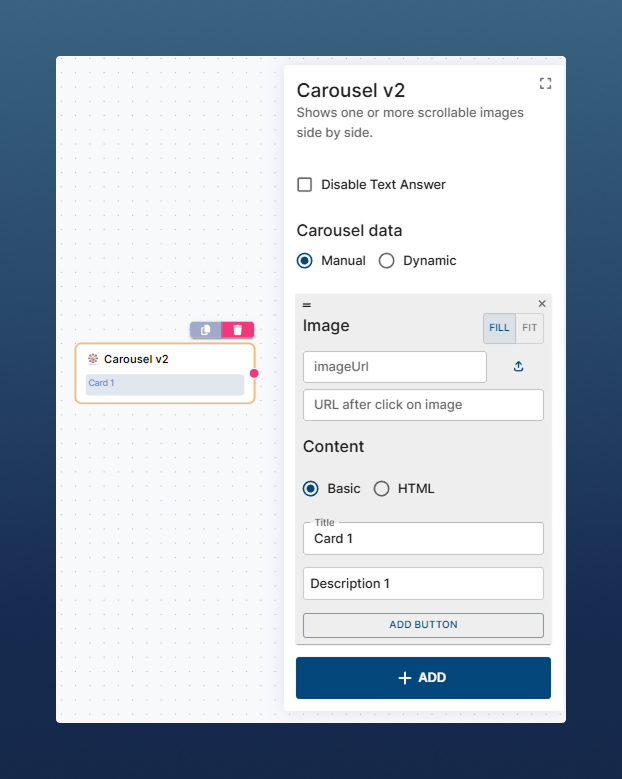
Manual Mode
-
Add cards one by one inside the editor.
-
Each card can include:
-
Title + Description
-
Image and Image URL (opened after click on image)
-
Multiple Buttons
-
URL buttons – open a link
-
Action buttons – behave like buttons in normal chat messages (continue dialog flow)
-
-
Dynamic Mode
Instead of creating each card manually, it is possible to generate them from a JSON array stored in any $context variable.
-
Each object in the JSON = one card in the carousel.
-
Card components (title, description, image, link) can be mapped to JSON keys.
-
Use template syntax:
{{ title }},{{ description }}, etc.
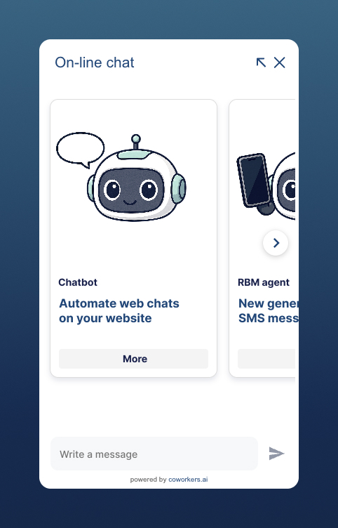
Example JSON
[
  {
    "name": "Chatbot",
    "description": "Automate conversations on your website chat",
    "imgUrl": "https://cdn.../Chatbot.png",
    "link": "https://www.coworkers.ai/chatbot"
  },
  {
    "name": "RBM Agent",
    "description": "Send SMS with rich content",
    "imgUrl": "https://cdn.../RBMbot.png",
    "link": "https://www.coworkers.ai/rbm-agent"
  },
  {
    "name": "Voicebot Outbound",
    "description": "Automate outgoing calls with Voicebot",
    "imgUrl": "https://cdn.../Voicebot.png",
    "link": "https://www.coworkers.ai/voicebot-outgoing"
  }
]
Dynamic carousel usage steps:
-
Store your JSON in a
$contextvariable (e.g.$cwProducts). -
In the JSON with carousel data section, choose the
$context. -
Map JSON keys to carousel components (title, description…) using
{{ }}placeholders (e.g.,{{ prodName }}).
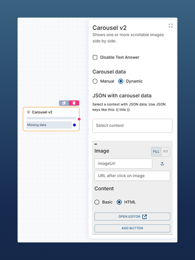
Custom HTML Mode
For advanced customization, switch from Basic content to HTML content (contact support if you cannot see this option in your Carousel module). This unlocks a full HTML editor where you can define your own card template.
<div class="product-card">
  <a class="title" href="{{link}}">{{name}}</a>
  <div class="price">{{description}}</div>
  <div class="action-btn">
    <a class="more-btn" href="{{link}}">More</a>
  </div>
</div>

<style>
.product-card { width: 100%; padding: 12px; color: #04477A; }
.product-card .title { color: #18214D; font-weight: bold; text-decoration: none; }
.product-card .title:hover { text-decoration: underline; }
.price { font-size: 18px; font-weight: bold; margin: 12px 0; }
.action-btn { display: flex; gap: 8px; margin-top: 8px; }
.more-btn { flex: 1; background-color: #F4F4F4; border-radius: 4px; padding: 6px; text-decoration: none; font-weight: bold; }
.more-btn:hover { opacity: 0.85; }
</style>
This allows you to:
-
Match your brand’s CSS styles
-
Add custom actions (e.g., “Add to cart” button)
-
Build completely unique layouts
Best practice
When to use which mode:
-
Manual → Small, fixed sets of cards (like FAQs or top 3 links).
-
Dynamic → Larger, data-driven carousels (e.g. product lists, search results).
-
Custom HTML → When you need full control of style and functionality.